The shape of color
This post is an extended cut of my twitter thread, posted here for posterities sake
In 1867, Bertrand Riemann gives his inaugural lecture “On the Hypotheses which lie at the Bases of Geometry”, first outlining the field of differential geometry. To motivate 3D curved spaces, he notes “the only simple notions whose specialisations form a multiply extended manifoldness are … colours” (From this translation). The space of colors has been studied geometrically since geometry was born, connecting math with biology and psychology and physics. Color theory really has bottomless subtly. I recently fell down a rabbit hole connecting colors with special relativity, and Riemann surfaces, and all sorts of cool stuff!
Axiomatizing colors
Apparently there’s a long tradition of Physicists shoving their grubby hands into color theory. Of course the grandaddy is Newton, who invented color theory while locked in his room for two years, quarantining from the black plague (He handled it better than I). Color space geometry was frontlined by quantum field theorists like Weinberg and Ashtekar. We can thank Schrodinger for mathematically axiomatizing color theory.
Imagine fitting the perceivable colors into an abstract space. Schrodinger says:
- Axiom 1: we can scale colors (change their brightness)
- Axiom 2: we can add positive amounts of colors together (shine two colors at the same time). This means the space of colors fits in a vector space. Since you can only add and scale by positive amounts, it has to be a cone.
But what’s the dimension? It is experimental fact that three fixed colors can be combined to simulate an arbitrary third color. Makes sense, since our brain only measures the output from red, green, and blue cones. This gives:
- Axiom 3: The vector space is 3-Dimensional We parametrize this space with red green blue (RGB), or hue saturation brightness (HSB), or YUK or IDK whatever we want. All in all, The space of colors is a 3D solid cone
Structures on color space
Perceptual color is weird, because it’s background dependent. Changing the background gives a natural map on our space of perceived colors, and let’s say it’s linear (It’s not, but shh). These are our symmetries. See the discussion in this paper
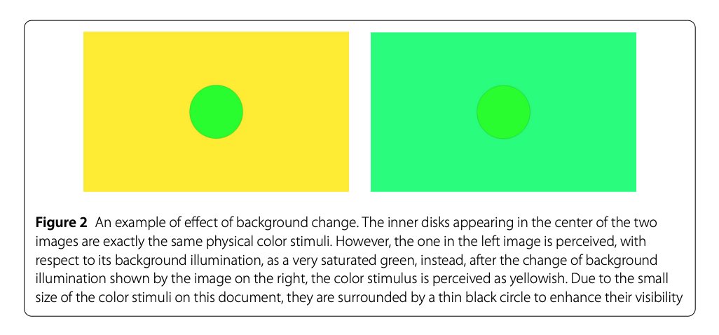
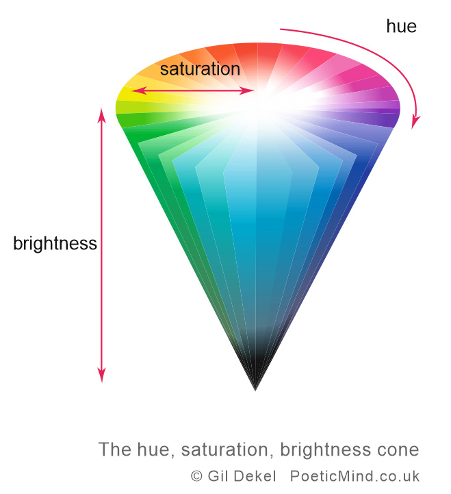
Any two colors look the same with the right backgrounds (I find this incredibly dubious, but shh), so our symmetries can map one color to any other. This means every color is ‘the same’, so our cone is ~homogenous~. Moreover, it has a metric, the perceptual distance between two colors. For example, orange is closer to red than blue. This scales up with brightness, and is Obviously preserved by the rest of our symmetries (shh). Thus, the cone is actually \(\mathbb{R}^+ \times \mathcal{S}\), with brightness a positive number ℝ⁺ and 2D symmetric space 𝒮 representing hue/saturation (see Fig. 2). \(\mathcal{S}\) is a 2D symmetric space representing hue/saturation. Lie group theory leaves us with three possiblities:
- \(\mathcal{S}\) is a sphere with positive curvature
- This is impossible, since \(\mathcal{S}\) is not compact (shh)
- \(\mathcal{S}\) is \(\mathbb{R}^2\) with a flat, Euclidean metric
- This is the usual assumption is standard color theory canon. Its boring though, so we could try the thrid option…
- \(\mathcal{S}\) is the hyperbolic plane \(\mathbb{H}\) with constant negative curvature
- Now things get spicy…
 |
|---|
| Fig 2: space of colors in the HSB representation. The brightness is the \(z\)-direction, and the space \(\mathcal{S}\) are circular slices. These can either carry an euclidean or hyperbolic metric. |
Colors are hyperbolic?!?
In this third case, we can choose coordinates to make the metric on \(\mathbb{R}^+ \times \mathcal{S}\) have the form \(-\mathrm{d}b^2 + \mathrm{d}h^2 + \mathrm{d}c^2\), where \(b\) is the brightness, \(h\) is the hue, and \(c\) is the chroma (saturation times brightness). It’s like special relativity: Time is brightness, space is hue / chroma! Let’s see how far we can take this analogy…
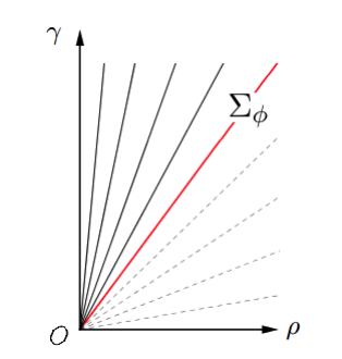
Changing illumination applies a Lorentz boost. Shine a brighter light, and your saturation (speed) asymptotically approaches a maximum saturation (speed of light), achieved by pure frequencies (see Fig.3). Perceptual colors act like ‘velocities’ less than “the speed of light”. See Origins of Hyperbolicity in Color Perception
 |
|---|
| Fig 3: The vertical axis is brightness, and the horizontal chroma. The lines show the colors with constant saturation. All colors have saturation less than 100%. This acts like the speed of light, a line that can never be crossed. |
This is empirically tested, I think?? Hilariously, its ambiguous wether the original paper did any tests, or just thought experiments. The paper above thows its fair share of shade lol.
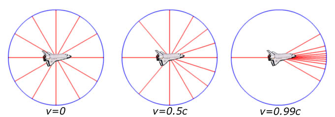
All in all, brightness = time, saturation = speed, and hue = angle. Colored backgrounds distorts the hue, like how relativistic velocities distort the field of stars (Fig. 4). e.g, a bright orange background makes red and green more orange, but doesn’t change blue. The hue/saturation wheel is the hyperbolic plane in the poincare disc model, and changing the light perceptually looks like an automorphism of the hyperbolic plane
 |
|---|
| Fig 4: As a spaceship moves close to the speed of light, it distorts the lightrays coming in. The stars on front of you expand to fill up more of your vision, while those behind contract. |
personal fantasies
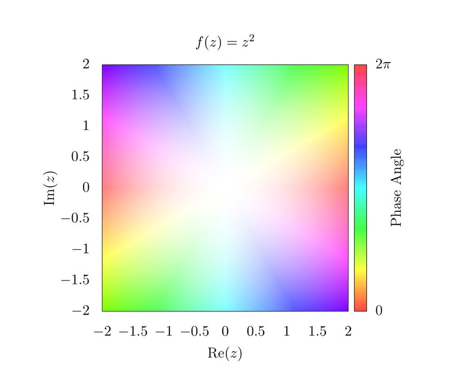
Out of weakness, I must speculate: What if you take one of those complex complex phase plots (Fig. 5)s, and shine a different color light on top…
 |
|---|
| Fig 5: Holomorphic function on a complex plane. The magnitudce gives the saturation, while the phase gives the hue. |
Perceptually, That’s alllllmost applying a Mobius transform. A Riemann surface structure comes from local maps to the hyperbolic plane, related by hyperbolic automorphisms. Could this structure be colorings of a surface, which different patches perceptually glued together by different lighting? I need to think more to get it to work, but theres potentially a totally awesome visualization hiding in here…
Critical evaluations
I’m not sure I buy this. I’ve sushed away many of my problems. The big thing is, people have actually measured the metric on the space of colors. By putting two colors next to each-other and seeing if the human eye can discern them, we get a local notion of distance (See this thread by @akivaw). This metric is very much not homogenous, so what’s the deal?
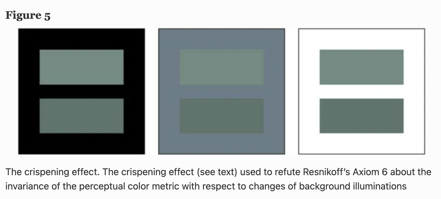
I think the experiments are measuring a biological metric, dictated by the resolution of our rods and cones. In contrast, that described above is psychological, measuring how far apart our mental conception of the colors lie. an Ontological metric, if you will. Unfortunately, this isn’t symmetric either. The crispening effect says that psychological distance between colors can be ampiified with a carefully chosen background, violating background invariance (Fig. 6).
 |
|---|
| Fig 6: The crispening effect, from this paper |
Still, I can’t let go of the hyperbolic color space. I want to imagine spaceships when I mix colors together, it’s just human nature. It makes a lovely story. :)